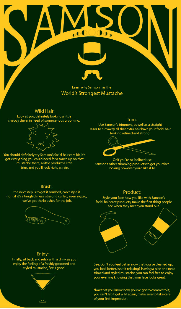


the problems pointed out to me by the class were the colors: the green was too dark and appeared black on the screen, the icons: we all know what's going on in the image without them, so they become unnecessary.
The style of the title while the best-looking part of the advertisement is still in need of some work and has to be redone. there were too many words, and they were too cramped to mean anything, no one wants to sit and read all that, especially since they're such simple ideas, they don't need that much to explain them.
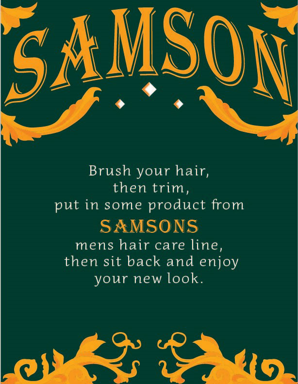
Finally, it wasn't a part of the critique but I wanted to make the overall look of the piece better so I used some decorative elements that I designed to complement the words and the title on the page as best as I could.
I used the font Algerian for the large title and Acuta for the body text.

I needed more white in the image to balance all the green and gold, I decided that the outlined back part of the letters in the title would make it stand out the most out of everything I could have changed, It also made the most sense considering I couldn't change the decorations without considerably more work in balancing them afterwards.


